My Music Video

My Outside Digipak Panels

My Outside Digipak Panels

My Inside Digipak Panels

My Inside Digipak Panels

Please click the image below to view our finished website

Wednesday 3 January 2018

Evaluation Question 1: In what ways does your media product use, develop or challenge forms and conventions of real media products?

All three of our media products, the music video, album cover and website, use, develop and challenge forms and conventions of existing media products to create visually interesting and unique products that meet our TA's needs and expectations of the industry.

Our Music Video

A music video is an important product in promoting the single, album and artist as well as making a statement on the artist's image and the creative vision associated with them.

Form

Simon Frith's music video theory states that there are three main forms of music video and they are: Narrative, Performance and Conceptual.

Below is a mind map giving details on these forms and examples of each. Please click the present button in the top right hand corner to make full screen, and click and drag to navigate.


From this theory we applied the hybrid form of having a Performance/Narrative music video, in keeping with genre conventions and to the lyrics lending themselves to a simple, universal story on relationship.

Narrative

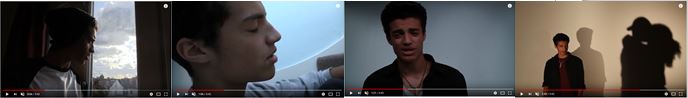
Our video contains a narrative that shows AJ looking back on his relationship with his girlfriend that ended after she cheated on him, with him expressing how he feels about the relationship as a whole and the break-up itself.

It was important that our dual narrative had a basic structure and was easy to follow as we wanted it to be a universal story that our audience could understand and relate to. To ensure this we followed Todorv's Narrative Theory which has been detailed in relation to our plot in the table below.

Narrative structure theory applied to our music video

A real music video that really inspired our narrative was Ne-Yo's 'Miss Independent'. We followed the structure seen in this video, common fro the R&B genre, of the story being fragmented and fit in around performance and dance shots.

The full video can be seen below along with screenshots from the video giving the basic outline of the story interspersed throughout the performance shots.


Another convention we developed within our narrative in the music video was Carol Vernallis' theory on the audio-visual aesthetic, in particular the fragmented and disjointed nature of a music video through discontinuous editing. This is seen in the montage of the girlfriend and the man she is cheating with and the argument between her and AJ. 


Andrew Goodwin's theory states that there must be a link between the lyrics and visuals in a music video to help create meaning throughout. We followed this in our video by having specific narrative shots on certain lines to match what was being sung. This can be seen below on the line 'Why did you leave me all alone', where the first time the girlfriend walks out on AJ and the second time AJ looks around registering that she's left him again.


Performance

Our music video is predominantly performance with narrative interspersed throughout. We have a range of different set ups for lip-syncs both in the studio and on location with several dance sequence set ups as well.

Lip-sync

Goodwin's theory on the link between lyrics and visuals was also important in our lip-sync on lines such as 'I found out from him' where AJ points at the other guys shadow, and 'Now its your turn to cry' where AJ points down the camera.


For the lip-sync it was very important that it was authentic and portrayed a lot of emotion in fitting with the lyrics and narrative of the song. This part of our performance was heavily inspired by Jason Derulo's lip-syncs in his videos.

Jason Derulo examples of authentic lip-sync

Our examples of emotion portrayed through lip-sync


Genre

In order to meet audience expectations and needs it is important that our video convey a strong sense of genre, conforming to specific R&B conventions. Our video uses and develops these conventions throughout in order to be easily recognisable as an R&B music video and challenges some conventions to reflect the artist's personal beliefs and make the video stand out. Below is an Emaze going into more detail on this.


Website

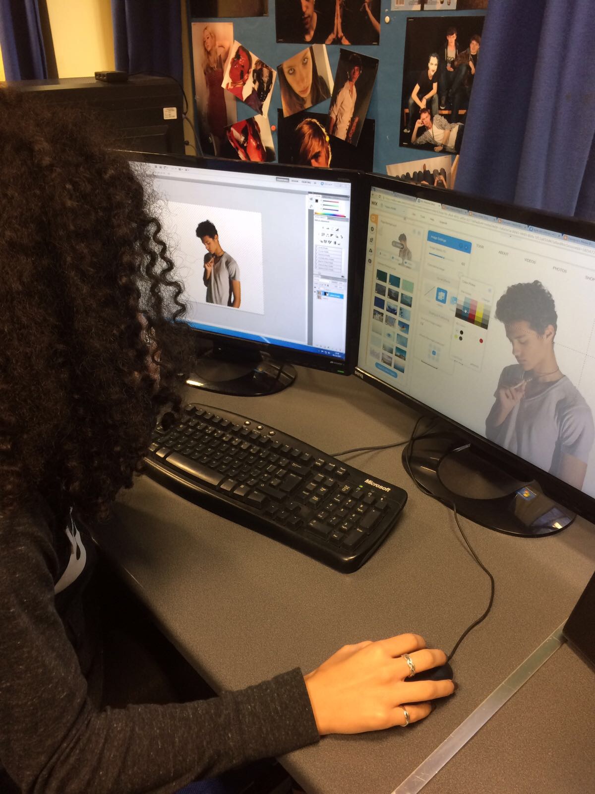
Below is a Prezi detailing the key aspects of our website and how we followed conventions of real ones.
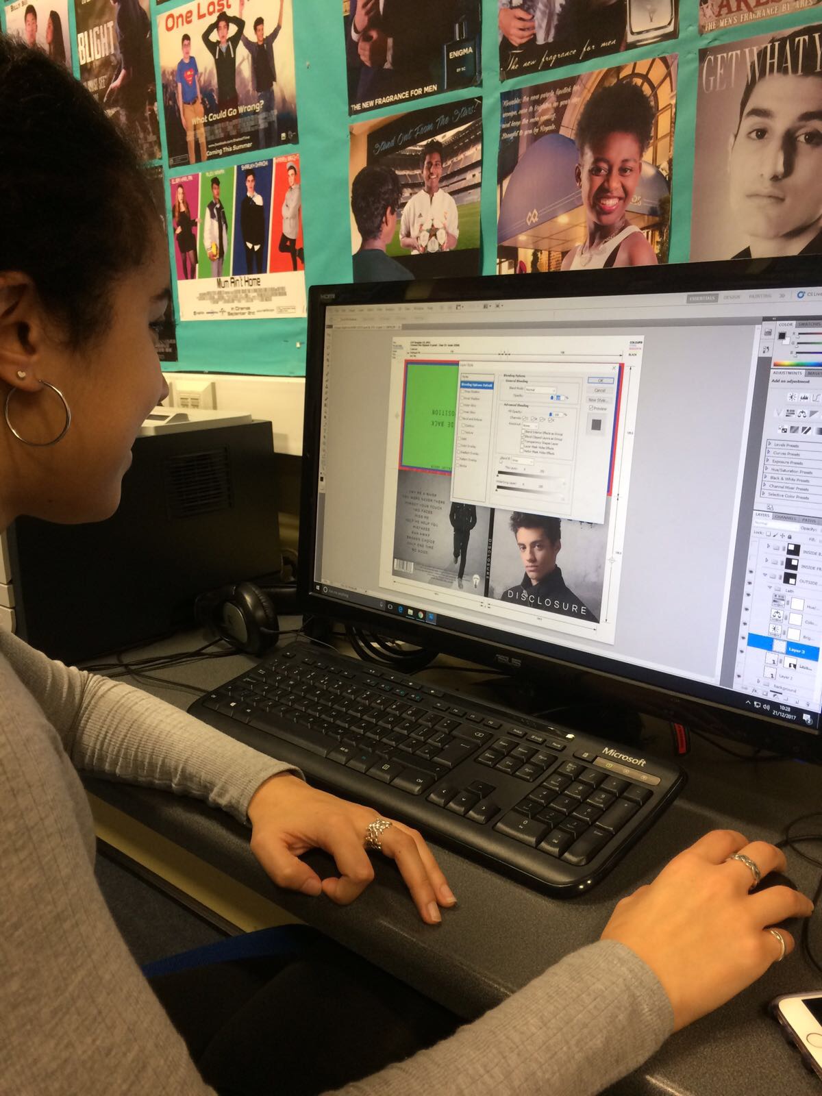
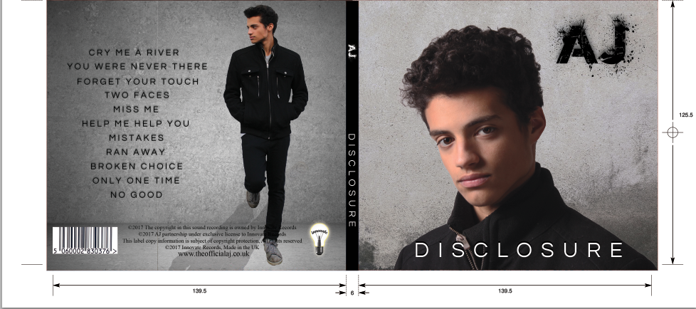


Digipak

Below is a Slide show analysing a reference album cover and our panels in accordance with digipak conventions.


To conclude, I feel that we have successfully used and developed forms and conventions of real media products across the music video, website and digipak, creating authentic products which meet the audience's needs. Where we have challenged conventions, I believe that this has helped our products stand out and be unique in the market.

Evaluation Question 2: How effective is the combination of your main product and ancillary texts?

All three of our products, the music video, the website and the album cover, were created with the specific intention in mind to work together in synergy to produce a successful marketing campaign to launch a new artist and their debut album into the industry. The website acts as the hub for all of the information on the artist, promoting them as a brand and all of their related products, the music video then works to promote the single and album and in turn the album promotes the single, the website and the artist as a whole.

Marketing Campaign

The aim of any marketing campaign is to have as wide a reach as possible with low wastage and high appeal to get an audience to buy a product and become invested in the brand behind it. For a music artist the brand needing to be bought into is themselves - their Star Persona - and the product is the album or more common now-a-days, single tracks as well as concert tickets and merchandise. 

When deciding how we would structure our cross media marketing campaign and integrate the release of our products we researched different artists' campaigns to get an idea of timing and related content. 
Below is a diagram giving examples from Raleigh Ritchie's marketing campaign with specific relation to his social media and how this created his Star Identity, increased his reach and promoted not just his music and acting but also current important issues such as mental health and equality.

Examples from Raleigh Ritchis's marketing campaign

We took a lot from this case study and applied it to our own campaign to ensure it is as realistic as possible 

Theory

The Marketing Mix, with reference to the 4Ps, was also influential in our decisions in creating the 3 products, ensuring that they were effectively combined to appeal to our TA. The breakdown can be seen below.

  • Product: We created 3 product that are available for audience enjoyment and escapism, that use, develop and sometimes challenge conventions of real media products
  • Place: To ensure as wide a reach as possible, all of our products are available online, which given the increased use of Web 2.0 across all demographics, is the best place for them, allowing for interactivity and sharing that could start a viral campaign and increase AJ's fan base.
  • Price: Our album, merchandise and tour tickets, which are the biggest source of revenue, are all sold at affordable prices, lower than many other artists' and should attract a bigger following for AJ.
  • Promotion: We have reached our audience through online platforms such as social media, YouTube, the website and live events such as a Meet and Greet at Westfield Shepard's Bush as well as a competition sponsored by JD.

Social media promoted on website
Video on YouTube


Synergy 

In order to create a successful marketing campaign, it was important that there was consistency across all of the different platforms and repeated images to increase brand memorability, essentially creating a synergistic, cross media marketing campaign using both above and below the line marketing techniques. The key ways that we did have been detailed below in the Prezi on our marketing campaign as a whole.


Star Identity

Marketing theory states that 'when the audience is not interested in the person, product or service being promoted, they will not seek out any information about them'. It was important that we did not fall into this trap and created an artist with a strong, marketable personality that inspired fans. To help us achieve this we used Richard Dyer's 'Star Theory' which describes how a true star has lasting significance, as they convey beliefs, ideas and thoughts outside of their music, giving them more relevance in aspects of life outside of making music, and in turn allows them to build an iconic brand that crosses industries.

Below is a mind map going into detail on AJ's star identity and how we created it, with the help of Richard Dyer's 'Star Theory'.


Ultimately, I believe that our three products work very well together in synergy to create an effective and realistic marketing campaign that appeals to the TA,


Evaluation Question 3: What have you learnt from your audience feedback?

Throughout this whole process getting and reflecting on audience feedback was very important to our decision making to ensure that we created 3 products that appeal to our TA. We received feedback throughout construction as well as at then end on the final products and I have analysed this below after explaining who are TA actually is.

Our TA

Primary Audience:
  • Fans of R&B - both old school and contemporary. These are the people who would actively seek out and engage with this music
  • Both genders
Secondary Audience:
  • People aged 12-25 as this is the biggest age demographic of music consumers and as AJ falls into this age group he can be inspirational and relatable for them
Tertiary Audience:
  • Fans of similar or mixed genres such as pop or hip hop and R&B or soul as they are likely to like the style of music that AJ makes

Appealing to our TA

Whilst creating our products to appeal to our TA we kept the uses and gratifications theory in mind at all times as goals that we had to meet. Below is an Emaze demonstrating how we used the theory throughout our project.


Audience Feedback

Music Video

For the music video, we received feedback regularly throughout the process - on the stealo, the rough cut and the construction of the final video. This was very helpful for us and the table below gives details on the feedback we received on the rough cut and how we responded to it in the final video.


As well as implementing these specific changes from the rough cut in the final video, we got feedback from our teachers, family and friends at the halfway stage. The responses we got at this stage were helpful for fine tuning our edit and gave us suggestions such as adding more discontinuous editing in the narrative and special effects on the dance break.

Creating the ghosting effect over the dance sequence improved our final cut massively as before we added it, the dance sequence looked slightly awkward. We showed members of our audience the dance break both with and without the effect and they all agreed that it looked better with the ghosting, with one person saying that 'the effect made the dancing look so good and really slick'.

eg of dance break with and without effect
Our views as of 17/1/18

Once our final edit was finished, we uploaded the music video to YouTube which was very useful as it allowed us to break down our viewers by country of residence, age and gender, giving us useful data for the analysis of the feedback.


The photo below shows the global breakdown of who has been watching our video on YouTube.

Breakdown

This showed that the majority of our viewers are from the UK, which is expected with AJ being a British artist. In addition to this, we also received views from people in the United Arab Emirates, USA, Australia and Germany, highlighting the importance of social media sites in ensuring a wide, global reach.


The gender breakdown was also very useful to us as it highlighted that both genders are engaging with our video, which is what we wanted from our TA. It does, however, show a higher percentage of males watching the video than females, split roughly 2/3 to a 1/3, which, whilst I would have preferred a more even split, does not surprise me as males are more likely to watch a video with a strong male lead that they can relate to.

Gender breakdown

As well as collating viewer data for our analysis, YouTube enabled comments to be left on our video and we actually received very positive feedback from this. The comment left praised our styling, editing, filming and overall creativity, which can be seen below in full.

YouTube comment

Survey

In addition to the feedback received on YouTube itself, we created an online survey on Survey Monkey and put the link on YouTube with the video as well as sending it out to our family and friends. This allowed us to collect a range of different responses to our video, some of which I have analysed below.

Above is a few example questions from the survey


The age breakdown below shows that the most common age demographic watching and responding to our music video is 16-24 which is really good as this falls within our TA age range. In addition, we got responses from people younger and older, including those in our secondary and tertiary audience, giving us a wide base for receiving feedback.

Age breakdown from Survey Monkey


The majority of people who took the survey correctly identified the genre as R&B but there was still a fairly large proportion who said that they thought it was a Pop video. This was slightly disappointing as it suggests that we didn't make the genre clear enough in the video and needed to include more R&B conventions but as the song is mainstream and very well-known, this could also play a part in the confusion.

Some responses to the genre question


Examples of people's favourite shots
The survey also allowed us to collect data on our audience's favourite shots/parts of the video. We got a huge range of responses from this question with people picking out the dancing, the silhouettes and shadows, which overlapped with some of my favourite parts, as well as sections such as the phone ringing and the argument. 

I was really pleased by the varied responses we got as nearly every set up was covered as someone's favourite and the hard work we put into creating visually interesting lighting and grading paid off.


The last question in our survey asked the audience to rate the video out of 10 and I was very happy to see that the majority of people thought it deserved 10/10, saying that there was nothing that needed changing. This, coupled with the 86% yes or maybe answer to 'From watching the video, would you like to know more about the artist?' really pleased our group showing that the audience was engaging not just with the video as a standalone, but the artist brand behind it.

Rating out of 10

We did receive some constructive criticism through the survey as well which is helpful in highlighting to us where we could have done better. Some feedback we got was that there should have been more dancing throughout the video and that we shouldn't have shown the new boyfriend's face to create more suspense. In addition to this, when asked what the message of the music video was, whilst most picked up that cheating is bad and relationships need work and good communication, the idea of forgiveness, being the bigger persona and moving on with your life away from the hurt was not picked up on. This was a shame as we wanted this aspect of AJ's personality to come across and in hindsight we could have made this clearer by making a bigger deal of the forgiveness section of the narrative before AJ walked away for good.

Focus Groups

As well as collecting quantitative feedback on the music video, we did small focus groups of people from our TA to get more in depth, quality responses. The video for this can be seen below. We have included the responses throughout when they are watching the video and the more in depth questions at the end starting at 3:46.


I was very pleased with the responses that we got from the focus groups as they picked up on the little details we added in the narrative such as the picture of AJ and his girlfriend on the phone. As well as this, some of the favourite shots that were picked out were the same as those that we found in the survey and messages from members of our TA, an example of which can be seen below.

Feedback example

Website Feedback

Whilst creating our website we made sure to get feedback throughout the creation process as well as at the very end.

An example of this is when during construction we got feedback from a friend to include the social media icons at the top of every page to make them clearly visible and accessible as some people may not want to scroll all the way to the bottom to get to them.

Our header with the social media icons

We also had a focus group to get in depth feedback on our website which can be seen below.


The feedback we received from this focus group as well as from members of the TA that we sent the link to, was very positive with us receiving feedback such as 'I really liked the logo', 'the whole design is very sleek and professional' and 'the personal touches showing more of AJ' personality were really good'. I was very pleased with this as it showed that our careful planing of content had paid off and our website looked authentic.

Digipak  Feedback


Feedback example
We followed the same process for getting digipak feedback as with the music video and website, receiving opinions on our work throughout construction ass well as at the end.

The main change that we made during construction was to scrap our original idea of having the layered photo on the back. When we edited it in, as a group we really didn't like it and after asking member of the TA what they thought, we changed the idea when they agreed with us. Our final image on the back panel is a simple LS of AJ leaning back against a wall, which worked a lot better that the planned image.


After making this change we received very positive feedback on our album cover as a whole and some of the responses can be seen below.
Feedback example

Feedback example


I was very pleased with these responses as I am proud with how our cover turned out and people really liked it. The inside left panel was a favourite across the feedback which again I am happy to hear as it is my favourite too.

We also carried out a focus group to get feedback from two member of our TA which can be seen below.


Conclusion

On the whole, I have learnt a lot from the audience feedback process during this project. It was very useful to get the TA's thoughts and opinions throughout construction to ensure that any tweaking that needed to be done to create effective products that appeal to them could be carried out. Feedback on the final products was very pleasing as it was positive on the whole and made me very proud of our work.

Tuesday 2 January 2018

Evaluation Question 4: How did you use new media technologies in the construction, research, planning and evaluation pages?

Throughout all stages in this process, Research and Planning, Construction and Evaluation, we used a range of different technologies, both old and new, to help us create 3 effective media products and I have learnt a lot from this.

Below is a mind map summarising all of the technologies we used in each stage. Please click the button with the screen on it at the top right to make the mind map full screen and click and drag to move around the branches.


Research and Planning

Below is the Prezi I have created to discuss the pros and cons of each technology we used during this stage and their importance in conjunction with 'old' tech research and planning.


Whilst planning it is important to note that we did still use 'old technologies', for example we created a huge paper timeline and post it note storyboard which the whole group could sit around and work on together. Newer, advanced technology is so beneficial but the value of 'old school techniques' shouldn't be overlooked; the two can be used together for the best outcomes.

Construction - Production and Post-production

I have created an Emaze, which can be seen below, breaking down each of the technologies we used during this stage and the benefits and any drawbacks associated with them. 


Evaluation

The technology I used for the evaluation has been explained below with details on their ease of use and overall effectiveness.


Conclusion

Throughout the project I learnt how to use a lot of new technology as well as developing my knowledge of ones that I had used before. I was pleased to be able to improve my editing skills on Premiere Pro and actually have become much quicker now as a result of this project. In addition to this, I have learnt how to use Wix, the sound desk and the lighting desk which I really enjoyed. Having our media technician, Sam, on hand to help was very useful as if I had any questions or worries about using the equipment he was always there to help.

Overall, I have learnt a lot through the making of the music video, digipak cover and website and the vast amount of time and effort that is required to make effective, professional products. Technology played a huge part in this, both old and new, as detailed in the web tools above as it allowed us to communicate quickly and clearly as a group, making decisions and completing our work to a standard that we can be proud of.

Saturday 23 December 2017

Construction Post 6: Website Post-Production

To create and design our artist's website we used Wix. Although none of us had used Wix before, it was very straightforward and by the end we were all comfortable using it.

It was important that we created a cohesive and interactive website to act as a hub for all the necessary information about the artist that worked in syngery with the other products and offered purchasing opportunities.

Home Page

I started off post-production on website and began with the Home page, creating the scrolling background, the video strip background and adding in the album information.
Me editing the focal image for the home page

Below is a photo of our home page. Please click to enlarge and read the annotations.


We also included a social media section at the bottom of the home page where the latest tweets and instagram posts could be seen as well as direct links to Spotify, the artists Instagram, Twitter, Facebook and YouTube channel. This was inspired by the social media section on Jason Derulo's website and a side by side comparison can be seen below.


Music Page

A big part of making money, the music page offers a lot of purchasing opportunities. The music video for 'Cry Me A River' is at the top with a break down of the album's songs below which are designed to take you to PayPal when you try to buy a song or the album.


This page was actually one of the quickest pages to create as it is very straight forward and the only thing we had to wait for to complete it was the edit of the music video.

Tour Page

The Tour page contains all of the dates and venues of AJ's upcoming UK Tour, with links to Ticketmaster to buy tickets.

Below is a screenshot of the table on the tour page.


This page was actually a bit harder to create than some of the others as we originally tried to just edit the dates and venues in the template's tour table. This didn't work however, and in the end Meera created our own table separately and copied it into Wix afterwrads, adding all the buttons and links.

About Page

The About page starts with a quote from British music magazine NME, appealing to the crossoer audience with them.


As well as this, I created a click through Q&A with AJ section on the About page, giving the fans an opportunity to get to know him. Below is an example of this.


Gallery Page

This page consists of photos of AJ both promo shots and behind the scenes from the studio and location shoots. In addition to this we've added the behind the scenes footage of the music video as a fun extra for the fans to enjoy and to show AJ's goofy personality.
Shop Page
Again this page was very important as it was a huge purchasing opportunity for the audience. Whilst we originally thought that this page would be really hard to do, in reality it was a lot easier than we expected. Wix provided a really easy to follow and edit template which we customised for the products that we wanted - screen shots of which can be seen below.

Shop page
Product detail

The only thing I wish we had added to this, was a picture of a second angle of each product as you hover over it with the mouse, but unfortunately we ran out of time to do this. I am still very pleased with this page though and the range of products on offer.


News Page

The News page was were we put our competition, increasing the websites interactivity and linking in with social media as well as information about radio show appearances and an Instagram Live Event.

Below is a picture detailing our competition.


It was important that we had this because it gets the audience involved and actively participating and on social media will in turn help push a viral campaign with positive word of mouth which, ultimately, is the goal as free advertising.

Target Audience Feedback

After talking to members of our primary and secondary TA here are the findings from our feedback.

  • The focal image on the home page was very popular - everyone liked it
  • The repetition of the music video was good on both the home page and music page 
  • The behind the scenes video was funny and gave a good insight into the artist and the excitement of shooting a music video
  • The website was very easy to navigate
  • Social media links should be at the top of the page as well as bottom
I am really pleased with how the website came out overall, as it is clear and easy to use, ultimately doing its job as the main hub for all of the artist's information and we all picked up how to use the software very quickly.


Construction Post 5: Digipak Post-Production

To create our Digipak album cover we used Adobe Photoshop. It was important that we got this right as album art is key in promoting the artist and their music, especially for a debut album, where it introduces the artist to the public and industry.

Below is the template that we used for the front and back outside panels - a similar template was used for the inside panels too.

Template
Outside Panels

Below is a picture of our final outside panels.


For the digipak I cut out both photos for the front and back panel using the select tool and and refine edge, taking care to paint back in any of Laith's hair that got cut to give a clean and believable look. In addition to this I edited the writing out of the original picture of the background for the back cover.

Me editing the front panel

For our artist name, album and song titles we had to download two new fonts: World Conflict and Questrial-Regular.

We chose World Conflict because we wanted something tat would stand out and look good repeated across all of the marketing platforms. The edgy, spray paint look fit with the British independent vibe we were creating as well as the simple, grungy, grey background.

World Conflict font 

For the album and song titles we wanted something simple and professional that contrasted nicely with World Conflict and didn't take away from the focal image. In the end we settled on Questrial-Regular.

Questrial-Regular font

Both the backgrounds for the front and back cover were a similar grungy, grey colour with texture. As seen in our research and planning post this followed genre conventions and allowed the focus to stay on the artist's image which as a debut album is very important. Our main inspiration for the backgrounds was from 'The Best of Amy Winehouse's album cover which can be seen below.


For institutional information the back cover was very important and we had to ensure we included the record label logo, barcode, artist website, album release date and copyright.


Inside Panels

Below is a picture of our inside panels


Our inside left panel consists of a black and grey gradient of AJ's side profile filled with words that mean something to him and the album. Included are words such as 'dignity', 'change' and 'forgiveness', words that express AJ as a person and as an artist who wants to create music that really matters to people. We hoped that this idea would not only look visually interesting but also add a personal touch, as all the things that went round AJ's head when creating the album, giving an authentic feel to the digipak.

The right hand panel where the CD would be is a simple MS from behind AJ. We made the photo black and white to fit with the rest of the digipak and the black, grey and white colour scheme. We kept this panel simple as most of the time it would be covered by the CD.

In keeping with British indie feel and an artist that wants to bring back elements of old school R&B we thought that the simpler we kept the digipak concept the more effective it would be, especially with its colour scheme.

Target Audience Feedback

After speaking to members of both our primary and secondary audience we collected the following feedback on our digipak.

  • The colour scheme works really well and is eye-catching
  • The inside panel with the side profile and words was the favourite as it really stood out and wasn't commonly done 
  • It looked professional
  • It wasn't always recognisable as R&B but those who said that went on to say that they would still look at the album because it was eye-catching and introduced the artist well
I am very pleased with our digipak and I really enjoyed editing the photos and creating the final product. I love the aesthetic we've gone for and am pleased that ideas I was really excited about carrying out right at the beginning of the project, such as the words in the head, actually came out really well and was liked by others.

Construction Post 4: Music Video Post-Production

We edited our music video using Adobe Premiere Pro which we used last year for the AS and at GCSE.
Me editing on Adobe Premiere Pro

We stared by watching our rushes through and renaming them in their folders of day and time they were shot and uploaded. Although it was good that we had a lot of different takes and therefore choice, this did mean it took us a lot longer than we would have liked to rename them all. From there we chose the best overall take for each lipsync and synced them with our track so that when we needed a shot we could just cut in and out of what was already there and it was already synced, saving time later down the line.


We decided as a group to share the responsibility for completing each of the products, so that we all had a good amount of time to work on each. During the last week though, with the deadline approaching, we all took the product we were quickest at doing and went where we were most skilled to ensure we finished on time. For the edit my main contribution was editing the second half of the video, the dance break, grading and fine tuning the cuts throughout.

Changes from test edit

One of the big changes we made from the test edit was being more daring with our framing choices and how they worked together. For example in our test it tended to get visually boring with mainly just MLS and MS but in our real edit we made sure to be a bit more daring and actually follow music video editing conventions of going from CUs to LS - really varied framing.

Below you can see a comparison of the framing we had for the test and real edit.
Example of similar framing throughout test edit
More varied framing in real edit
Another change from the test edit was the addition of fades to and from black as transitions. Laith edited a lot of these in and we think it works really well, having been done in a lot of R&B music videos and made the integration of our narrative shots a lot smoother.

Below is an example of a lipsync fade to black and the narrative shot fade from black that follows it.


Effects

When we first edited the dance break we realised that even with the cuts to different angles and switching to me and Meera doing the choreography at some points - inspired by the dance sequence in Ne-Yo's Miss Independent - it still looked a bit boring and not quite what we had envisioned. To try and improve this, after speaking to our teachers who suggested trying an effect, I added a ghosting effect where I layered a duplicate of each shot on top of the original, starting it a few frames later and turning down the opacity. Although there is a tool that can do this automatically, when I tried that in the beginning it ghosted the footage too much and as you can't change the levels we had to do it manually. In the end I was actually really pleased with how the ghosting came out as it made the dance break a bit edgier, contrasting nicely with the rest of the video.


Revisions

Once we had a complete timeline and were moving onto fine tuning, we asked our media teachers and technician to look at our video and give their opinion. The main thing that we got back was that they thought we were playing it too safe with out edit and we needed to experiment a bit more. In response to this we tightened up a lot of cuts and varied our shot length a lot more. We also added jump cuts into the end of the argument to give a more trippy feel to the sequnce, which can be sen below.


Laith and I also spent time going through the completed timeline shot by shot, picking out little things we wanted to change, for example we moved the narrative up as we felt that it became too rushed towards the end, and we needed to break up a long sequence of lip sync over the first pre-chorus.

Target Audience Feedback

Once we had made our own revisions and those based on our teachers' feedback, we asked members of both our primary (R&B fans) and secondary (12-25 year olds) TA for their feedback.

The response that we got from both was very positive with everyone saying that to them it really did look like an R&B music video - meeting their expectations. Everyone asked also said that they could follow the narrative and that there was clear links to it and the song's lyrics.

The shots that went down the best were:


  • Silhouetted dance shots


  • Screen shadow shots


  • Quick pan into studio


I was so pleased that these three were picked out as the audiences' favourites because they are the ones that we liked the best as well.

In addition to the music video, Meera edited a short behind the scenes video that includes bloopers and shows just how much fun we had making the music video. This will be used on the website as a fun extra for the fans.


Below is our final music video:


Overall I really enjoyed editing the music video because it was a lot of fun to watch all of footage and to have a hand in turning all of that into a video that looks professional and effective and that we are actually proud of. I got to try new editing techniques and effects that I hadn't used before and had the opportunity to get really creative and daring with the edit. We worked well as a group, with everyone having a say and getting to explore their own creative ideas and we all agreed that it came out a lot better than we were expecting after the test edit.